
Tuesday, August 25, 2015
Tuesday, July 21, 2015
Project: Honor Candle
Project: Honor Candle

 Inspiration: We're really interested in honoring our family on our wedding day, and that includes those who have passed away. The bouquet charms is one way we are doing it, but we wanted something more "public" as well, to let everyone know, particularly the aunts and uncles, that we are thinking about our several late grandparents. I liked the candles like this I saw online, but, knowing we couldn't do an open flame pillar, thought about doing a lantern.
I then remembered the craft I had pinned at one point about transferring images onto candles, and wondered if I could combine the two, rather than having a sign. I thought it was a nice opportunity to personalize the gesture to craft something meaningful.


Cost/Materials: You'll need a lantern with a big enough glass face that you'll be able to read the candle through it. I got mine at AC Moore - they have a great selection and this one was originally about $10 I believe, but I used a 40% off coupon to only spend $6 on it. The candle I used was flameless, for two reasons (1) to avoid any open flame issues with the venue, although it probably wouldn't create an issue, and (2) because I didn't want the candle to actually melt and result in disfiguring the transfer I was going to put on it. The candle did need to be real wax, though, for the transfer process to work. It's "Nicole" brand, purchased at AC Moore, and was relatively inexpensive. Other materials you need include white tissue paper (Dollar Tree), any piece of regular 8.5''x11'' paper, tape, scissors, a heat gun or hairdryer, a printer (inkjet worked fine) and something to protect your hands from the heat such as gloves.

How I Did It: I created my transfer image in Powerpoint. The first thing I did was check the size of the candle (how big of a surface did I want to cover, how tall was the candle, etc.) and then change the page size to make sure I worked within those constraints. Then I wrote our message in and used the same pictures (sepia-toned) of our grandparents that I had used for the bouquet charms. To keep them all the same shape, you can see the process in the photo (crop, mask to shape, basic shapes, oval). I then gave them soft edges since the backgrounds were all different.


The next step was to wrap the tissue paper around the candle and start heating it up. I used a hairdryer for this, though I am sure a true crafting heat gun might have worked more easily. What happens is the wax starts to melt and basically soaks through the tissue paper, absorbing it into the candle. You can see it starting to happen in the picture to the right, in the spots where the tissue paper starts to become clear instead of white.


You'll want to work quickly once you see the wax soaking through, because if you let it go to long, things will start to morph. If you get to a point where it's starting to pool, it's okay to let the candle cool down and solidify and start again later before things get out of control. Same goes for any little pockets/air bubbles that come up, like this one you can see on the right side of the candle. I waited until it was cool, then gave it a concentrated shot of heat and bravely smoothed it down with my finger.
The Outcome: Here it is in the lantern! The candle looks cooler when you can see it flickering, but you get the idea.


 Lessons Learned/Tips: It gets hot holding something that you're using heat on! I ended up grabbing a kitchen mitt (see photo left, ignore toilet) to protect my hand, however I didn't realize it had some bits of crumbs on it.. which ended up melted into the back of the candle. I was able to get most of them out, but just make sure any hand protection you use is clean! And lastly I'd recommend that depending on where you're going to put the candle that you decide whether you want one that is scented or not. I hadn't realized this one was scented until I got it home, and it wasn't a big deal to me, but if you were going to use candles on the tables of a reception, you'd probably want them to be unscented so that the candle scent doesn't clash with or overpower the food.
Would I Do It Again: Yeah, this would be a fun craft to use in the future for other purposes, e.g., maybe transferring photos onto candles for an party or to give as a gift or something like that.
Project: A Lovely Love Story
Project: A Lovely Love Story
 Inspiration: I came across the "Lovely Love Story" by Edward Monkton when I was reading this article on Offbeat Bride. We have some other readings in mind for the ceremony, so I thought about where else we could use it. It was sort of silly, so I decided maybe it could go in a coloring/activity book for the kids. But, I decided I'd like to share it with more than just our adorable ring bearer and flower girl. So, I decided I would make a display of it. At this time I also remembered the super cute dinosaur cake toppers I had seen online. We wouldn't be using those for a cake topper because dinosaurs aren't thattt special to us (although with the excitement on my fiance's face the entire time we were watching Jurassic World, you might think otherwise), but what if I used something similar for little props/visual interest!? Thus the project was born. Here is a link to the dinosaur cake toppers (per the picture included) that I really liked and drew my inspiration from.

 Cost/Materials: The dinosaurs are probably going to be the biggest cost if you do this project. I originally thought I would go with bigger ones (that would run closer to $6-10 a piece) but since I am perpetually cheap and found some adorable, albeit miniature, ones for $2 each plus coupon, I ended up with those. I got them at Michaels. Also at Michaels, I had picked up these black foam numbers and symbols, just because they were on clearance, but it ends up they worked out perfectly for the hat and bow tie. These could alternatively be made with paper/ribbon, but I like the look of the foam. The gemstones were another clearance find at 90 cents for the whole package, and the small piece of tulle was borrowed from a roll I got at Dollar Tree for a different project. I used super glue to keep the accessories on the dinosaurs. For the story, I used Vistaprint to get an 11''x17'' print to make the story easy to read at a distance wherever we set it up (I'm thinking near the photo booth so people have something to check out if they're waiting for their turn, or at the bar). I got a easel stand at Hobby Lobby to hold the story up, but it ends up it's too small because the poster print isn't as stiff as I thought it would be - I'll need to find something else.


 How I Did It: One of the first things I did was re-format the story. I kept the integrity of it and of course cited the author, but I wanted it to read smoothly, since the story refers to its two characters as "The Dinosaur" and "The Lovely Other Dinosaur." To show the differences, I stacked their back-and-forth parts, and gave them different fonts. Then, I just had some fun decorating the dinos! Originally I just had a necklace on the "bride" dino, and a bow-tie on the "groom" one, but it wasn't quite enough. My fiance suggested a top hat for the groom, which I fashioned out of pieces of the foam (cutting them up and supergluing them together), and then I gave the bride a veil to match. I superglued all these accessories. Even though all the elements had a bit of adhesive on their own, it wasn't enough to trust, especially if guests are picking them up to check them out.
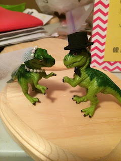
The Outcome: They're looking ready for a wedding! I'm pretty pleased. Can't wait to see what it looks like all set up and whether people like it!

Lessons Learned/Tips: I learned that the "poster" stuff from Vistaprint isn't all that thick, so it's a bummer that I'll need a taller frame/easel to support the story, but not a big deal.
Would I Do It Again: Yes, but I might use slightly bigger dinosaurs. They are super super cute, but they're really dwarfed in comparison to the story (2.5'' dinos, 17'' tall story board).
Wednesday, July 15, 2015
Project: Message in a Bottle
Project: Message in a Bottle

 Inspiration: I saw images like these online and really liked them. The idea of the "year anniversary" was cute, but I heard a couple heartbreaking stories about parents and grandparents who were sad to put things into bottles they thought would outlast their lives (e.g., a 50 year anniversary), and that made me sad, and I don't want any sadness! So I opted for a "leave any message" bottle, that we'll decide together when to open. Maybe after the honeymoon, maybe in one year. I wouldn't be surprised if we're unrolling notes on the plane ride to whatever honeymoon destination we choose.

How I Did It: I made the note template in Microsoft Word, leaving some space in the left margin for where the hole would go. I tried a few different configurations/sayings, and my fiance helped me decide on the one I used ("Message for the bride & groom, from: _____". I used the "from" because sometimes I've seen at weddings activities like this and there's no direction to leave your name, but I'd love to know who the notes come from. They can always leave it blank if they want to share something anonymously, but I like the reminder to share who it's from. I printed these and cut them up, then it was time to add the string. To make the holes sufficiently strong, we (read: my mother) created reinforcements. As you can see in the picture, she punched out a bunch of yellow circles, then we used a tape runner to stick those to the note templates, then used the hole punch to put the hole right through the middle of the two. Then we added string, about 12 inches, to ensure people would have an easy enough time wrapping it around and tying it off. 12 might seem like a lot, so feel free to play around, but you'll find since it is automatically halved when you tie it on, then loses some as you wrap it around the note, it's really not all that much. For the "directions" sign, I made it in Microsoft Word using some fun fonts I got from dafont.com. I think picking a few fonts to use throughout the event/decor is a nice way to tie different types of decor together, and it helps it look a little fancier than if you're using good old Times New Roman.
The Outcome: Here it is!


Would I Do It Again: I'll have to re-evaluate this one after the wedding to see how successful it was, but overall I don't regret my efforts here. I might have printed the note sheets on cardstock to save the painstaking process of reinforcing all those hole punches, but what's done is done!
Thursday, June 25, 2015
Project: Ring Box
Project: RingBox
Cost/Materials: The box itself I got for $1 at a craft store. I actually bought a couple different ones since they were so cheap; one option had a magnetic element that held it shut, but I liked the one with the actual hinge lock better. Plus, it looked sort of like a mini treasure-chest, and I thought our ring bearer would like that. The moss is overpriced at crafts stores - buy it elsewhere if you can! I got my bag (pictured) of reindeer moss at Dollar Tree for $1 and there is PLENTY in it to do this and probably some other projects if I think of any.


The Outcome: I love it! It didn't come out perfect (e.g., the letters are on slightly different horizontal planes), but I am totally okay with it. It's supposed to have that sort of hand-made, hand-loved look.

Also, when I originally tried this project with a different box (the magnetic one, that I ended up not going with), I closed the box after staining it, and it got stuck shut! I was able to pry it open, but be sure not to do something like this, as funny as it might be to see the best man struggle to get the rings out. :)
Would I Do It Again: Yup! Easy, and way cheaper than buying some fancy box online or in a store, plus you'll get to keep it around for ring storage if you need it. (I personally use a metal giraffe figurine ring holder... and I announce "regal giraffe!" roughly half the time when I put my ring on it).
Friday, June 19, 2015
Project: Bouquet Charms
Project: Bouquet Charms

 Cost/Materials/How I Did It: I'm going to actually just point you to the blog post that I used to create them! I followed these directions pretty much to a T, using similar products I got at Michael's. I really liked how things turned out with charms by Bead Landing. So, here is a link to the directions, and thank you to Sarah for writing great ones! http://sarahsaving.blogspot.com/2014/01/diy-photo-pendant-for-under-250.html
 The Outcome: I'm really pleased with these. They were easy to make, and are the perfect little sentimental detail for my bouquet.

 Lessons Learned/Tips: One thing I did a little differently from Sarah was that I didn't use (at least what seemed to be) original photos. I took pictures of the photos I wanted to use, then sent them to my e-mail. I opened them in Picasa (my favorite free photo editing tool), cropped them down to the sizes I would need, and turned them all sepia tone. This way I didn't have to worry about ruining any original photos, and I was able to print all four of my own grandparents for about 7 cents (yes, I couponed to get one 4x6 print at Walgreens).
Would I Do It Again: Yes, and I'll have to soon since I don't have the pictures from my fiance's side yet!
Wednesday, June 17, 2015
Project: Cork Heart
Project: Cork Heart

 Inspiration: Images like these online. I really liked the second one, where the colors come naturally from wine. The idea is to save the corks from all the wine served at your wedding and to create it with those. I thought this was awesome, but I'd rather not have one more thing to worry about on the day of the wedding (i.e., "are they collecting the corks?") and another project to do after. I decided to make something beforehand that I could use as a decoration for the ceremony and in our home afterward.
 How I Did It: First thing I did after cutting the corks in half was to put them in the basic heart shape. Then I was able to more accurately make decisions as I sectioned off how many would be in the truest yellow, how many in the yellow with a tiny bit of pink, equal parts pink and yellow, etc., until I got all the way up to the true coral pink. I only used two acrylic paints to create all these colors; just experiment with mixing! I did this on plastic plates with a plastic fork so I could dispose of the mess easily after. I starting dipping the corks in, patting them off a little on a paper towel if they picked up too much paint, and then putting them upright to dry. After they were dry (overnight), I arranged them on the canvas. This was a big old pain. I'm not sure how the people who created the ones in my inspiration pictures did it, but I was not able to get them to all smush together and look good, so I decided to space them out, somewhat evenly, into the heart shape. I hot glued them down, making sure to get plenty of glue on the whole backside of the cork, although not too much so that it was oozing out the sides when pressed down. Once this was all done I painted a phrase at the bottom. It took some patience to get the painting clear because the burlap was such a rough surface. Since it was dark, I also wasn't really able to pencil the writing on beforehand and then paint over it. Free-handing it was rough. If anyone knows how I could have better transferred the words before painting them, let me know!


 The Outcome: I am happy with it. Like I mentioned above, I wish the writing was a little better, but what can you do... I took a risk!

Would I Do It Again: I have plenty of corks leftover to maybe make something similar in the future, and it was simple enough! I'd maybe simplify even more by just doing a paper background within a shadow box or something like that. We'll see!
Check out my mom, helping me crank things out, burning the midnight oil! Thanks, Momma!

Project: Cork Letter Banners
Project: Cork Letter Banners

 Cost/Materials: I knew when I saw them on a shelf at Michaels that I wanted to try using these cork letters to make our banner. They are significantly smaller than the ones in the picture that inspired me, but I liked their natural look and that they would be easy (in theory) to string together. The box costs about $5, but even less if you extreme coupon like I do. I got them when they were on sale 50% off, which happens every so often for the "Natural Threads" collection they are a part of. Then I got a bit of clear jewelry string (I'm not actually sure what it's called, but it looks like imitation sinew/fishing line) for 99 cents. My recommendation is that you can probably find something cheap but still sufficiently strong. I also used sewing needles and pliers (necessary if you have delicate hands like mine). Optionally, you can also use some faux flowers to add a little extra something.

How I Did It: I started writing out some phrases, beginning with "We've decided on forever," then threaded a needle with the clear string. I put the needle into one side of the letter, about 3/4 of a centimeter down from the top of the letter, and did my best to keep it going straight through without it popping out the other end too far to one side or the other. Basically you want to make sure it's going to be secure, such that if the letter was tugged on it wouldn't fall off the line. As you put your phrase together, you want to make sure you're doing the letters in order and all facing the same direction. Each time I added one I pulled it a little further down the line to be sure the way I put it on matched up with the other letters. It's not difficult, but you're better safe than sorry! The toughest part about this was working the needle through some of the letters. Most of them weren't too tough, but some you really had to push, and pushing on the end of a needle doesn't work out well for flesh, so I started using a pair of pliers. Start the needle in where you want it, then use the pliers to push it as far as you can until it starts coming out the other end, then grab the part that is coming out with the pliers and pull it the rest of the way through. This honestly was tough for me, but I also have the hands of a child.
 The last thing I did was connect a few letter "U" pieces together and superglued some faux flowers to them, then strung the piece through the cork as a little extra decoration at the end of the phrase. I think it makes it look a little more romantic.
To have it ready for hanging, I was sure to leave plenty of the string on either end. My hope is our venue will have something we can either tie it to, or will allow us to use non-damaging 3M command hooks that a little loop of the string could be hung onto. We'll see what happens! I'm storing it hanging across a curtain rod so it doesn't get tangled up or warped.
The Outcome: I like it! The letters can be adjusted after they're on; the cork holds onto the string pretty tightly assuming you've used a small enough needle, so they have just the right balance of being adjustable but staying in place once you get them where you want them. Here is the main one I talked about, plus a photobooth directional sign I made while I was at it.


Lessons Learned/Tips: I tried painting the letters in our colors with acrylic paint, but it honestly didn't come out all that well. Just a heads up. It looked patchy and uneven so I definitely preferred them au naturale.
Also, because I'm a generally a stickler for grammar, I wasn't going to go without an apostrophe in the contraction ("we've"). I made this by cutting off part of an X since I figured it wasn't a letter I'd use many of. I actually cut it with the handy dandy wood burning tool I talked about in the last post. Cutting cork with scissors leaves a really uneven edge, but using the "exaco" type accessory on a heat tool lets you get a smooth finish. I also used it to do surgery on a few letters (turning Q into O, etc.) and creating an arrow for the photobooth sign.
Would I Do It Again: Sure. I bought a bunch of the boxes of letters so I can craft future things with them, not necessarily all banners. They're cheap, and I think they make a pretty bold statement.
Subscribe to:
Comments (Atom)